7 Tips to Choose the Best Color for Tinted Decorative Glass

Time:2026-10-24 Author:Sienna
0%

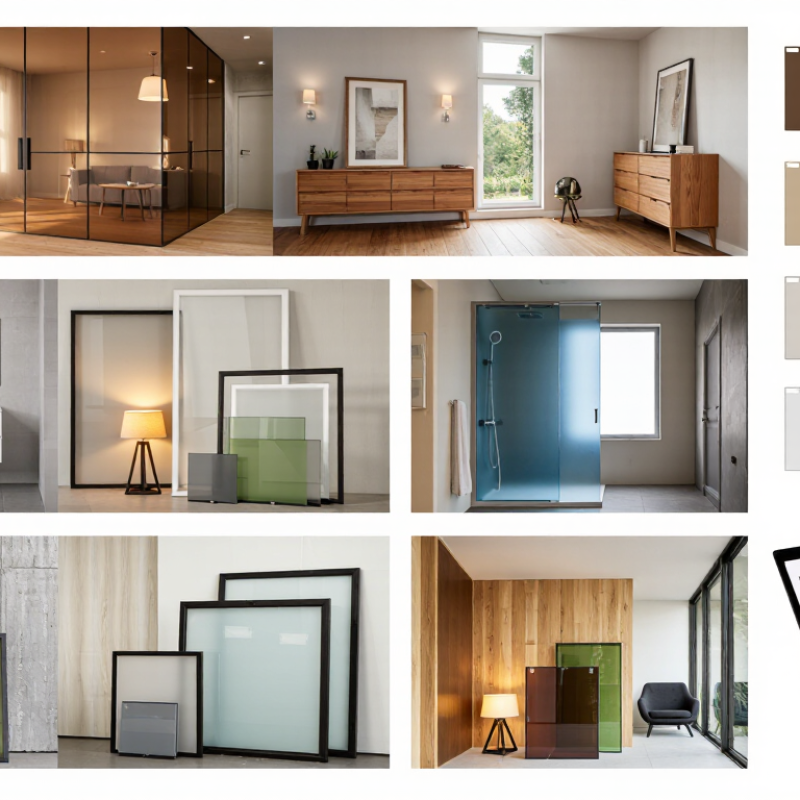
Choosing tinted decorative glass is not simply a matter of matching a color chart. The right shade must support the room’s purpose, lighting, architecture, and long-term visual comfort. A bronze panel may create warmth beside oak furniture, while a blue-gray tone can make a compact bathroom feel cleaner and more open. However, colors change noticeably under daylight, warm LEDs, and cloudy weather. That difference is easy to underestimate.

This guide explores how to choose the best color for tinted decorative glass? It considers wall colors, floor materials, privacy needs, glass thickness, and the effect of reflections. Practical experience shows that small samples provide better evidence than digital images. Hold each sample near the intended frame and observe it at different times. Morning light can reveal green undertones that showroom lighting hides. Evening light may make neutral glass appear unexpectedly brown.

Reliable selection also requires technical advice from qualified glass suppliers and installers. They can explain available tint ranges, surface treatments, safety specifications, and color consistency between production batches. A beautiful sample is not enough. It must also suit the installation environment and maintenance expectations. Even experienced designers sometimes misjudge a shade after viewing it alone. That is why comparing two or three options beside real materials is valuable. Trust the process, but question first impressions. A careful decision can turn a partition, cabinet door, shower screen, or feature wall into a balanced architectural detail.
7 Tips to Choose the Best Color for Tinted Decorative Glass

Define Color with CIE L*a*b* Values and Visible Light Transmittance

Choosing tinted decorative glass starts with measurement, not a color name. CIE L*a*b* values describe color more consistently than terms like “smoky gray” or “warm bronze.” Under ISO 11664-4:2019, L* represents lightness from 0, black, to 100, white. The a* axis moves from green to red, while b* moves from blue to yellow. A sample with L* 55, a* 2, and b* 8 will appear lighter and warmer than one with L* 40, a* 1, and b* 3. Small changes matter beside stone, timber, or brushed metal.

Tip 1: Request measured L*a*b* values and the testing illuminant. CIE Publication 15:2018 explains why lighting conditions influence perceived color. Compare samples under daylight, warm indoor lighting, and their final installation background. I have seen a neutral panel appear slightly green beside cool white walls. Real rooms can disagree.

Tip 2: Check visible light transmittance, or VLT, beside color data. NFRC 200 defines VLT as the percentage of visible light passing through glazing. A 20% VLT panel creates deeper privacy and stronger contrast, while a 60% VLT panel keeps interiors brighter. However, VLT alone cannot predict glare, reflection, or nighttime appearance. Tip 3: Compare full-size samples. Tiny swatches hide texture and edge effects. Record the target L*a*b* range, VLT, glass thickness, and viewing distance. Recheck the choice after installation lighting is confirmed. My own preference can still bias the decision, so independent measurement remains essential.

Compare Solar Heat Gain Using SHGC Ratings Under NFRC 200

Choosing a tinted decorative glass color involves more than matching a wall or curtain. The key performance number is Solar Heat Gain Coefficient, or SHGC. Under NFRC 200, SHGC measures how much solar energy enters through glazing. Ratings range from 0 to 1; lower values generally reduce indoor heat gain.

Start by checking the NFRC-certified SHGC rating, not the glass color alone. Dark bronze may look cooler, but visible darkness does not guarantee lower heat transfer. Compare samples beside a sunny window. Test the same tint in morning and afternoon light.

Consider orientation, because west-facing glass often receives intense late-day sun. Select lower SHGC glazing for hot climates or highly exposed façades. In colder regions, a moderate SHGC can provide useful winter warmth.

The U.S. Department of Energy reports that windows can influence about 25% to 30% of residential heating and cooling energy use. That figure makes color selection a measurable design decision. Ask for SHGC, visible transmittance, and U-value together. NFRC 200 focuses on solar heat gain, while these other values help explain daylight and insulation. Decorative patterns can also alter perceived brightness, even when the tested SHGC remains similar. My practical mistake was judging tint beside a showroom lamp; daylight revealed a very different color. Recheck the specification sheet. Then question whether appearance or cooling control matters more.

Balance Daylight and Glare Through 10%–70% Visible Light Transmittance

7 Tips to Choose the Best Color for Tinted Decorative Glass

Balance Daylight and Glare Through 10%–70% Visible Light Transmittance

Tip 1: Start with the room’s daylight. Visible Light Transmittance, or VLT, shows how much light passes through glass. A 70% VLT tint keeps spaces bright but offers limited glare control. A 10% VLT tint feels more private and shaded. It can also make interiors appear darker than expected. My first estimate was wrong once.

Tip 2: Match VLT with the room’s direction. South- and west-facing windows often receive stronger afternoon sunlight. Consider 20%–40% VLT for desks, dining areas, or reading corners. North-facing rooms may need 50%–70% VLT to preserve useful daylight. Test a sample near the actual window. Small differences matter.

Tip 3: Choose color after checking glare, not before. Gray tones usually reduce visual brightness without strongly changing furniture colors. Bronze or warm tones can soften a cool interior, but they may alter white surfaces. Tip 4: View samples during morning and afternoon hours. Glass changes character throughout the day.

Tip 5: Consider nearby walls and flooring. Dark finishes can make low-VLT glass feel heavier. Tip 6: Inspect the glass from both sides. Reflections may increase near glossy desks or screens. Tip 7: Ask a qualified glass professional to review light levels, orientation, and privacy needs. Decorative appeal is important, but comfort should guide the final choice. Mistakes happen when appearance is judged under showroom lighting only.

7 Tips to Choose the Best Color for Tinted Decorative Glass - Balance Daylight and Glare Through 10%–70% Visible Light Transmittance

Visible Light Transmittance (VLT) indicates the percentage of visible daylight passing through the glass. Lower VLT generally provides stronger glare control and privacy, while higher VLT preserves a brighter interior and clearer outward views. Actual performance also depends on glass orientation, window size, surrounding surfaces, interior finishes, and the complete glazing system.

Tip Recommended VLT Suggested Tint / Color Family Daylight Availability Glare Control Privacy Level* Suitable Locations Selection Guidance
1. Preserve a bright, open interior 60%–70% Very light neutral, pale blue, or soft green High Low Low during daytime North-facing windows, offices, living areas, display zones Choose this range when natural light and exterior visibility are more important than strong glare reduction.
2. Balance daylight and visual comfort 50%–60% Light neutral gray or subtle blue-gray Moderately high Moderate Low to moderate General façade glazing, meeting rooms, reception areas A practical starting range for spaces that need useful daylight with some reduction in brightness and reflections.
3. Reduce glare on screens 40%–50% Medium smoke gray or neutral gray Moderate Moderate to high Moderate Computer workstations, classrooms, west-facing offices Useful where direct sun or bright sky patches can interfere with monitors; glare may still require blinds or shading.
4. Add warmth to the architectural palette 30%–40% Bronze, warm gray, or muted amber Moderate to reduced High Moderate to high Feature partitions, hospitality interiors, west and south façades Warm tints can complement wood and earth-tone finishes, but they may alter the perceived color of daylight and interior materials.
5. Increase daytime privacy 20%–30% Dark smoke, charcoal, or deep neutral gray Reduced High Moderate to high during the brighter side of the day Street-level glazing, conference rooms, bathrooms, retail frontage Privacy depends on relative interior and exterior brightness; blinds, curtains, or opaque treatments may still be needed.
6. Create a cool, calm visual effect 20%–40% Blue, blue-gray, or blue-green Moderate to reduced Moderate to high Moderate Contemporary façades, spa areas, offices, decorative screens Cool colors can visually soften bright skies and coordinate with metal finishes; review samples under the actual site lighting.
7. Maximize shading and visual separation 10%–20% Deep green, dark bronze, or charcoal Low Very high High during daytime Strong-sun façades, privacy screens, feature walls, selected partitions Use only where reduced daylight is acceptable; confirm lighting requirements and local energy or safety criteria before specifying.
Important specification notes:
  • VLT is a daylight-transmission measure, not a direct guarantee of glare, solar-heat, or energy performance.
  • For strong sun exposure, evaluate VLT together with solar heat gain coefficient, shading geometry, glass reflectance, and interior shading.
  • Dark or strongly colored glass can affect interior color rendering and may make spaces feel darker than expected.
  • Review full-size samples in morning, midday, and afternoon light before final approval, especially for south- and west-facing glazing.
  • *Privacy ratings are relative and assume the interior is darker than the exterior; privacy can reverse at night when interior lights are on.

Check Color Consistency with ASTM C1048 and ΔE* Tolerance Values

7 Tips to Choose the Best Color for Tinted Decorative Glass

Color consistency should be checked before approving tinted decorative glass. ASTM C1048 provides quality requirements for heat-treated flat glass, including visual inspection and production controls. However, it does not replace a project-specific color tolerance. Ask for measured ΔE values from representative samples, not only photographs. Small differences can appear after tempering, coating, or lamination.

Tip 1: Compare samples under the same lighting conditions. Daylight, warm LEDs, and showroom lamps can change the perceived tint. Record the illuminant, viewing angle, glass thickness, and surface finish. A spectrophotometer gives stronger evidence than eyesight alone. Still, instruments can disagree when settings differ.

Tip 2: Set an acceptable ΔE tolerance before production. A lower value means closer color matching, but tight limits may increase rejection risk. Confirm whether the tolerance applies within one panel, between panels, or across different batches. Inspect several pieces together. One sample can mislead you.

Tip 3: Keep an approved reference sample in controlled storage. Label its glass thickness, tempering condition, and batch details. Check new production against this reference using the same method. I have found that visual approval often changes after installation. Recheck it in the actual space, especially beside stone, lighting, or metal frames. No color decision is perfectly objective. Reliable selection combines ASTM C1048 awareness, measured ΔE data, and practical viewing experience.

Verify Safety Performance Under ANSI Z97.1 and EN 12150 Standards

When choosing a tinted decorative glass color, safety performance must come before visual appeal. Dark tones can absorb more solar heat, increasing thermal stress in some applications.

Tip 1: Ask whether the exact glass construction has been tested under ANSI Z97.1 and EN 12150. A general certificate may not cover every thickness, coating, or color. Check the details.

Tip 2: Request current test reports, not only a printed compliance statement. The documents should identify the glass type, thickness, dimensions, and testing method. ANSI Z97.1 evaluates safety glazing performance, while EN 12150 focuses on thermally toughened soda-lime silicate safety glass.

Tip 3: Confirm that the report matches the finished product. Small differences matter. Really matter.

Tip 4: Inspect the glass edges before installation. Chips, rough cuts, or tiny cracks can weaken tempered glass.

Tip 5: Review the intended location, especially near doors, showers, stairways, or large windows.

Tip 6: Ask how the tint affects heat absorption and thermal movement. I have seen attractive dark samples behave differently in strong afternoon sunlight.

Tip 7: Verify that installers follow the specified clearances and support details. Even certified glass can fail after poor installation. One overlooked fitting may create pressure at the edge.

Also, color can hide early damage, so inspect the surface under angled light before approval.

FAQS

What do CIE Lab values explain about tinted decorative glass color?

L shows lightness from black to white.

Why should lighting conditions be recorded during color comparisons?

Daylight, warm indoor light, and cool LEDs can change perceived color.

What does visible light transmittance mean?

Visible light transmittance shows the percentage of visible light passing through glass.

Can visible light transmittance predict glare or nighttime appearance?

No. It only describes visible light transmission.

How does solar heat gain affect tinted glass selection?

A lower solar heat gain value generally reduces indoor heat entering through glazing.

Does building orientation change the best glass choice?

Yes. West-facing glass often receives strong late-afternoon sunlight.

Why are full-size samples better than small swatches?

Small swatches can hide texture, edge effects, and visual brightness changes.

How should color consistency be checked before production?

Compare several pieces under identical lighting and viewing conditions.

What information should an approved reference sample include?

Record its thickness, tempering condition, surface finish, and production batch.

What personal mistake can affect glass color decisions?

I once judged a tint under showroom lighting.

Conclusion

How to choose the best color for tinted decorative glass? Start by defining the desired appearance with CIE L*a*b* color values and checking visible light transmittance (VLT). These measurements help describe color objectively and show how much natural light can pass through the glass. Compare solar heat gain using SHGC ratings evaluated under NFRC 200, especially when the glass will be installed in areas exposed to strong sunlight. A suitable VLT range, often between 10% and 70%, can help balance daylight, privacy, and glare control.

Color consistency is also essential for a professional result. Use ASTM C1048 guidance and establish acceptable ΔE* tolerance values to ensure that panels look uniform across a project. Finally, confirm that the selected glass meets safety expectations under ANSI Z97.1 and EN 12150, including relevant impact and strength requirements. By combining visual measurements, thermal performance, light control, consistency checks, and safety verification, you can select a decorative tint that is attractive, functional, and dependable.

Sienna

Sienna

Sienna is a skilled marketing professional with a deep expertise in our company’s core products and services. With a passion for innovation and detail, she plays a pivotal role in crafting insightful blog posts that not only highlight the unique features of our offerings but also provide valuable......